Digital Painting Tutorial
Here's a Step by Step Process of how I work on a painting:Phase I - Concept + Research [Preparation]
[0.0. Concept:] Before I start doing any actual drawing or painting I brainstorm ideas for what the subject matter and message of the piece is about. This is the concept and for me is the most important part of the entire process. Starting with a strong concept is the foundation for everything that follows. I aim to define the concept with a few sentences. This is determined by the brief, or project goal, or story. In this piece the initial concept was "Futuristic sci-fi scene featuring a vehicle inspired by a classic automobile."
[0.1. Concept Refinement:] Starting with the initial concept i define the specifics of the story. For "Futuristic sci fi scene " I decide to choose a sunset on a bridge, and the vehicle will be inspired by Paulo Martin's 1970 Ferrari Modulo.
[0.2. Concept Research:] Once the concept specifics are defined I research the elements included in the piece. For this specific painting I gathered photo ref of bridges, sunset lighting, and the original 1970 vehicle.
[0.3. Thumbnail sketches:] I do thumbnail design sketches for all the main elements in the painting: the scene comp, the design of the elements, and the main vehicle. The design of the individual elements also communicate the story of a futuristic scene, so each element is designed to appear as something that could exist but doesn't yet for the year 2040.
Phase II - Painting Rough Block In
[1.1. Initial Comp:] Starting with monochromatic values I place the main elements of the painting. The general linear perspective and camera angle are also set. Dramatic lighting is also used to control the areas of contrast to set up the focal points. Using the rule of thirds, I place the front wheel and headlights at the vertex of the bottom left thirds. I set up the lighting conditions to create the highest amount of contrast of value and color in this area. Monochromatic values are used to create depth with atmospheric perspective using a limited value range in the Background [light values 2-4], Middleground [full values 0-10], and Foreground [dark 7-9]. Thinking about color theory I establish a simple foundation for a complementary color scheme of warms and cools [orange vs blue]. All of the previous thumbnail designs for the elements are also used in this step.
 [1.2. - 1.3. Comp Refinement:] First I flip the entire image to get a new look at what i have so far. I start defining the shapes in the bg thinking about how they relate to the rest of the painting. I create a secondary focal point by silhouetting a future city in the opposite third relative to my focal point, then I use the large sweeping curve of the bridge to lead the viewer back into the foreground where my main focal point is. I'm also using the warm lighting of the sunset in the bg and cool shadows in the fg to separate the bg from the fg. I also squint to check the value arrangements and see if the main shapes are working.
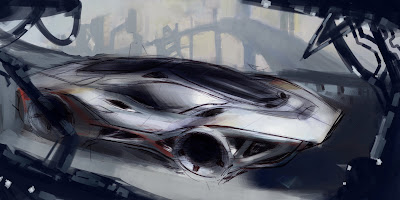 I add a small bit of preliminary lighting effects to test my ideas of the headlights and front corner as the main focal point. I check what i have done so far and decide its time to move on to the next phase.
Phase III - BG Rendering
[2.1. BG City + Bridge:] From here on out I'll mostly be rendering. My approach to digital rendering is a hybrid of techniques from traditional oil painting process [working bg to fg, tightening up in focal areas, controlling edges and gradients to make forms read], and the techniques offered by new technology [adding details and lighting effects].
After all the rough ins I begin finalizing the bg. My goal is to indicate a future city and bridge without actually completely rendering it. The purpose of this being not to distract from the main focal point that I will fully render later. I've increased the saturation and grouped the shape silhouettes to make them more dominant as a shape. I use a small amount of color shift to create depth of the bridge coming forward away from the sunset behind the city.
 [2.2. - 2.3. MG Bridge Rendering:] I fix the linear perspective from the previous step to define where the corners of the road are relative to the vehicle. I change the design form language of the structural elements of the Mg bridge seen in the upper corner to something more experimental and not seen today. I also change the design to to have dominant structures with subdominant rails or beams to create more interest. I use hard edges to define the shapes and highlight the corners of the forms with the warm light of the sunset.
  The changes I make to the vehicle are just place holders to remind myself of where I'm going later on in the painting. With the Bg and secondary elements 90% complete I check what I've done so far and move on to the focal point, the vehicle rendering.
Phase IV - Focal Point Vehicle Rendering
[3.1. Wheels:] The wheels are created using the ellipse tool as a guide to get the series of crisp concentric ellipses. I also keep in mind the lighting direction as i render. I only create one then duplicate and transform the other. Place both according to the pre existing perspective grid lining up the minor axis of both wheels to the vanishing point outside the image.

[3.2. Main Vehicle Body:] A simple step using value changes to show the form changes as the forms turn away from the light. I use mostly a digital airbrush with 10-30% opacity to build up values. I also don't worry too much about the edges as I'll clean everything up in the next step. The goal is to just get the main form changes to read.

[3.3. Defining Forms Using Edges and Values:] Continuing from the last step I use a hard edge brush with higher opacity to increase contrast and harden the edges to create crisp form changes. I also add the warm highlight on the far side of the vehicle and a hard edged reflective highlight to indicate the glass material change. The glass highlight is placed representative of the cool light source illuminating the front corner. I then use a smaller brush to add some of the smaller highlights and details. Lastly I indicate the wheels turning with a few brush strokes. When I'm satisfied with how all the forms read I move on to the last phase.

Phase V - Detailing + Effects
[4.1. - 4.3. Paint Stripes, Lights, + Textures] I add a paint stripe with a hard brush and create a headlight pattern using a light fx brush [glow-painter/colordodge-ps]. As I do so I'm thinking about my composition and remember why I set up the image in this way. I want the front corner to be my focal point so it should have the most value change[full range 1-10], clearly defined forms, and most color contrast [adjacent complementary colors]. I add some minor textures to the various surfaces using a hardlight layer with very low opacity to add some noise and variation to surfaces and some subtle warm light near the rear of the vehicle and cool light near the front. A minor touch is a bit of motion blur in very limited areas [near the wheels, on the road]. Everything is finally coming to an end. All that preparation work was for this moment.


The Finished Painting
[Final:] I flip the image once more, add reflections on the ground by duplicating and lowering opacity of the new layer, and add some final brush strokes just for my own taste, and its finally done - a full finished painting. Of course I can always go back and make changes but for now I consider this piece done and I don't have any more time to spend on it.

Thanks for reading this far. I hope this tutorial was helpful and enjoyable!


